

Viva Magenta was crowned Pantone's Colour of the Year 2023 and I can't say I'm surprised. Rich deep tones were becoming popular towards the end of 2022 and this is set to continue.
*
Now, I love nothing more than to buck a trend or throw traditions upside down, back to front and inside out, and that includes colour trends, but…

A) it might actually be something you really like, but you just don’t know how to make it work with the style you had in mind for your day ...
B) your partner loves the colour but you loath it (and visa-versa) so there’s going to have to be some compromise
C) something that is “on trend” is likely to be everywhere and hard to escape
I love this colour but I m not sure it fits with what I had planned?
You've looked at the colour a lot, something draws you to it, and you want it. But you don't know how to get it work with the venue you've already booked, or the ideas you have in mind for your day.
Colours are versatile, the styling and other elements will give your day the look and feel you want, whilst still using the colour you love.
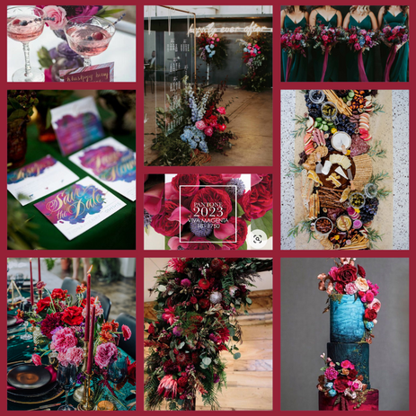
Take for example the Dark and Moody board below. Perhaps you're thinking how on earth can a bright colour like this fit with the industrial warehouse venue I had in mind? Juxtaposing the bright textured florals against the hard industrial surfaces and lines of the warehouse will not only funk up the space, but it will also show off the raw industrial elements even more.
Or maybe you feel that Viva Magenta is too rich and deep for a pretty summer garden wedding? Soften the colour with the use of more pastel tones, loads of greenery to add a more natural feel, and set it against crisp white linens and soft candle light.
Summer Berries* Dark and Moody*


I'm not a fan but my partner loves it, how can we compromise?
If you really don't like the colour but your partner is desperate for it, then use it...just not in everything. Use it as your accent colour, let the big blocks of colour be one you can both wholly agree on and then agree to have this colour pop in here and there to say hi! This is a great was to ensure you both have something to love about your day, but for different reasons.

In this example here, the bold teal is what really stands out, Viva Magenta is picked up in the floral centerpiece but the entire floral centrepiece is not given over to just that colour.
*
I'm finding it hard to escape the colour that is trendy?
My absolute number 1 rule for planning a wedding is, remember it is your day, if you don't like something save yourself the heart ache and just don't do it. There are so many options out there, trends come and go, stay true to yourself and your style. Always!
HL x

If you are having trouble aligning a colour to your style, my Design and Supplier Sourcing services will help. I can create mood boards for you according to what your looking for and once decided on a colour scheme and style, I can then source the suppliers and items you need to create the look. Take a look at my services here WEDDING DESIGN | hannahlucyevents (hannahlucyweddingandeventplanning.co.uk)
*These are not my own images, all images on this page were found on Pinterest as inspiration, the original sources can be found saved on my Pinterest page Hannah Lucy Wedding & Event Planning (hannahlucyevents) - Profile | Pinterest
Comments